Soft engineering:
the Kitt café chair

We talked to furniture designer Mark Gabbertas about how he fine-tuned the look, feel and timeless appeal of Kitt.
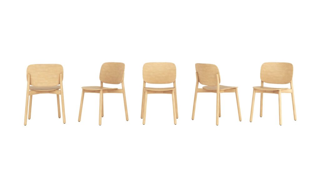
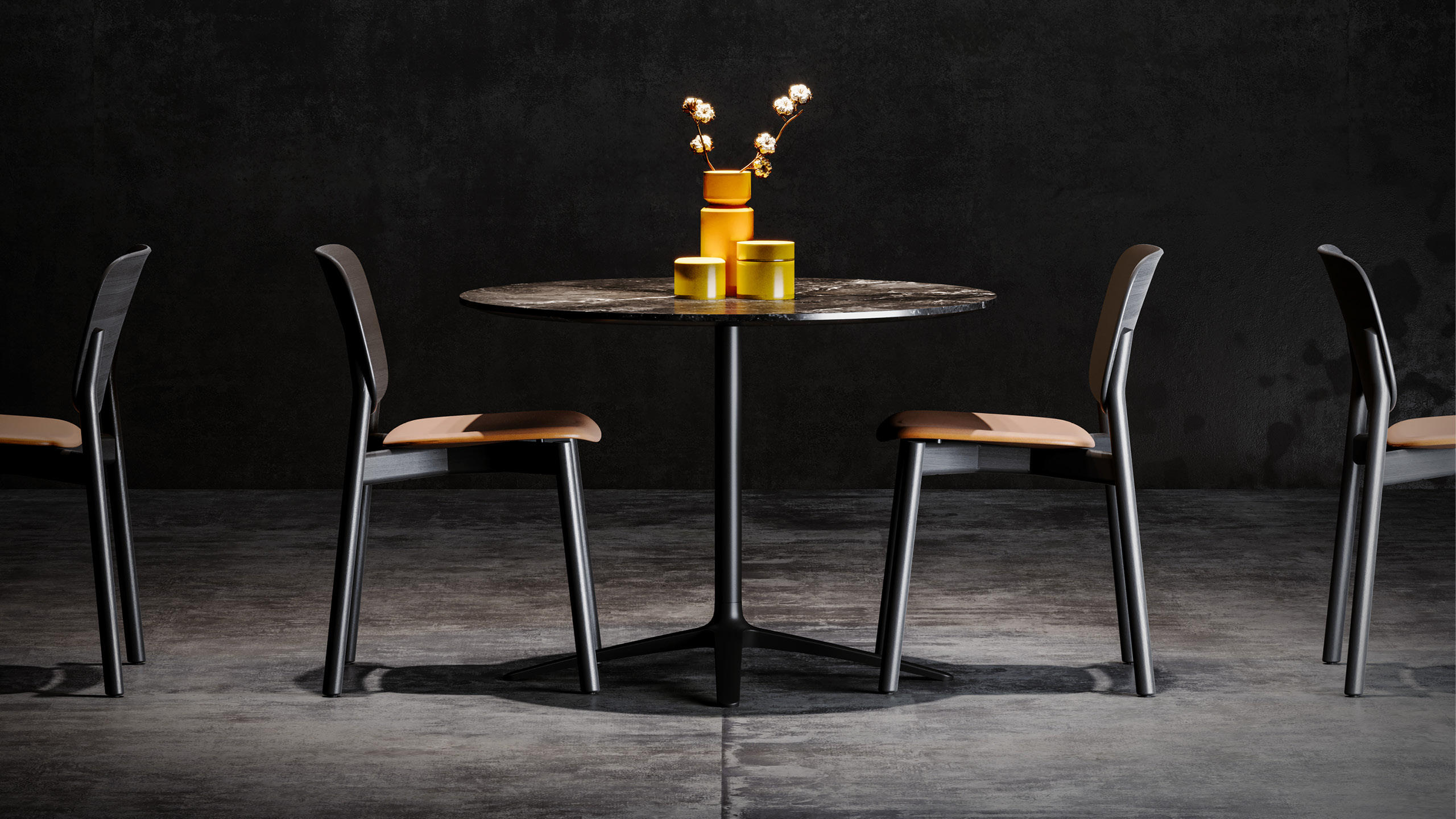
With its timeless look and feel, natural wood textures and refined forms, Kitt is a stacking café chair with a smooth and gentle personality. From casual restaurants to hotel dining areas and on to work cafés, it’s a chair that puts people at ease and provides an excellent sit. Designed by Mark Gabbertas, Kitt is the perfect extension to the Lyndon portfolio and here he joins us to explain the thinking behind this chair…
Sustainability has become a key element of furniture design, both for manufacturers and for customers. How was it a factor in the design process for Kitt?
I’ve always believed in the idea of designing for longevity and I’ve always believed that the idea of buying a chair that lasts is the best form of sustainability. I would like to think that this is one of those chairs.
It has been designed very much from our perspective that: “I’m not interested in trends, I’m not interested in fashion, I’m not interested in what happens to be of the moment, for today.”
This design is one that is meant to have a timeless appeal. That is always how we design. That’s always the way we will design.
So, there is creating something that physically lasts, and there is creating something that transcends trends or fashion?
Exactly. Let’s consider the build quality first. Kitt is being made by one of the most revered companies in the world for this type of product and we obsessed over the details and the design to give it a strength and to give it a quality of build that will last.
Secondly, I would argue the general approach and the aesthetic of this design is one that looks just right, and it looks just right because it has a universal, pleasing appeal that rises above novelty and mode and has the ability to be relevant for a long time. It’s a very tightly defined balance one hopes to find.
Why was wood chosen for this design, and what are its benefits?
My background is wood. That’s what I trained in, and that’s where I feel perhaps most comfortable in many ways, so it’s been interesting to go back to this material, having spent so many years designing more engineered and high investment types of furniture using more involved materials and systems.
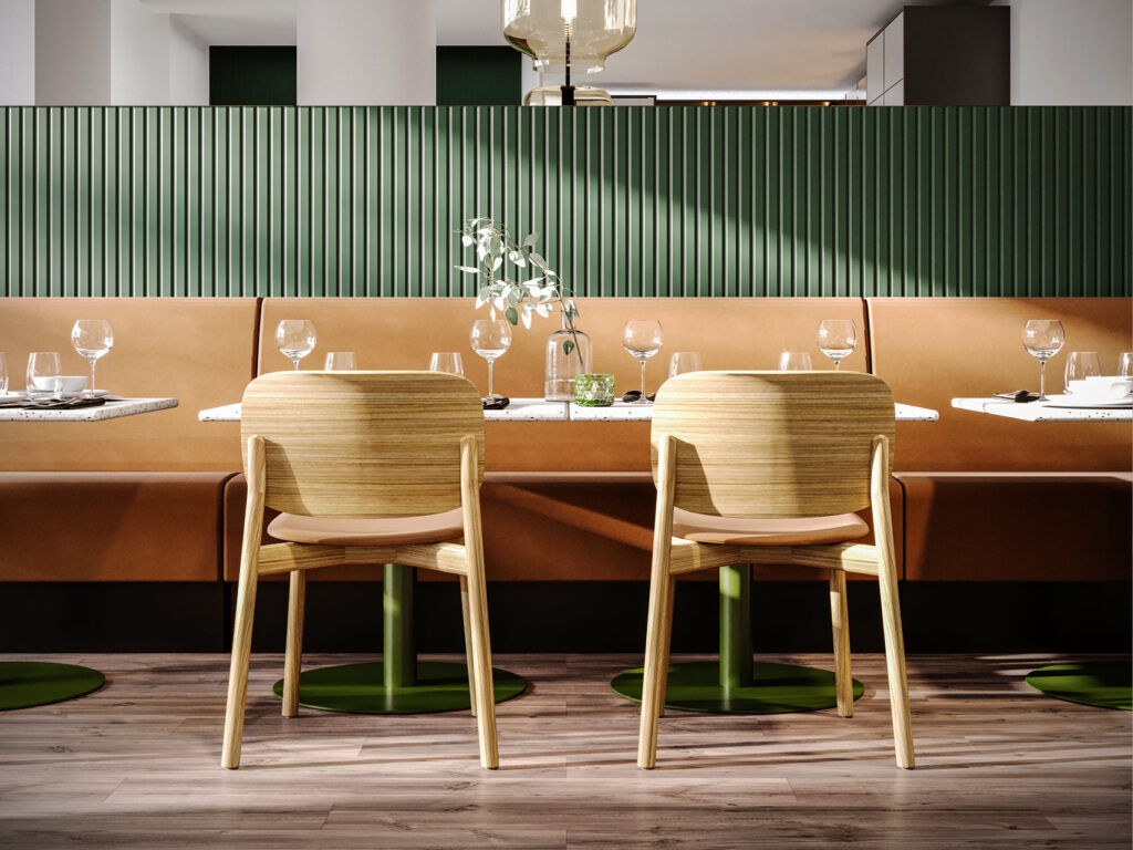
It’s interesting to go back to the purity and simplicity of wood because it has this longevity of appeal and of course it has a sustainability perspective to it. From a commercial point of view, there is a move towards including wood in contract interiors as it is both a warm and inviting material and one that is a natural antidote to the mechanised, hard-edged industrial world. I find this reassuring in that sense and so I have a very soft spot for the material when it’s used in an interesting way.
The forms you’ve created lend themselves to that idea, don’t they?
Creating the right feel and form is something we worked on for a long time. It has a soft but considered feel to it. It’s essentially a manifestation of soft engineering. There’s a precision to it, but there’s also a gentle serenity to it and it’s that combination that interests us. It’s that quite narrow band of aesthetic that you’re trying to find, and I actually do think that we have achieved this.
One compliment Kitt has received is that when you sit down it feels bigger than it looks.
This is about the ergonomics of the chair. I honestly think it’s the most comfortable chair that we’ve ever designed.
It is really easy – and by God so many people have done it – to design a chair that looks great but doesn’t actually sit very well. The objective of designing a chair has to be that it functions first and foremost, and the ergonomics of this chair are excellent. It’s something that we obsessed about for a long time, testing out various shapes, curves and angles to get the ergonomics spot on. We experimented and tested at prototype stage every element of the laminations – their angle, curve, overhang, lip, shape, size and relative position to the nth degree. And then repeated.
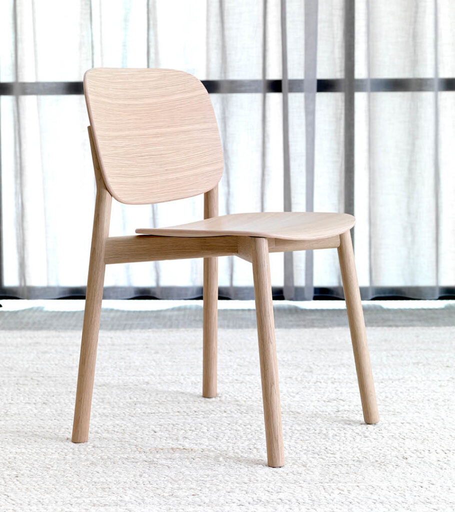
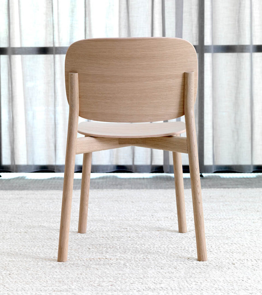
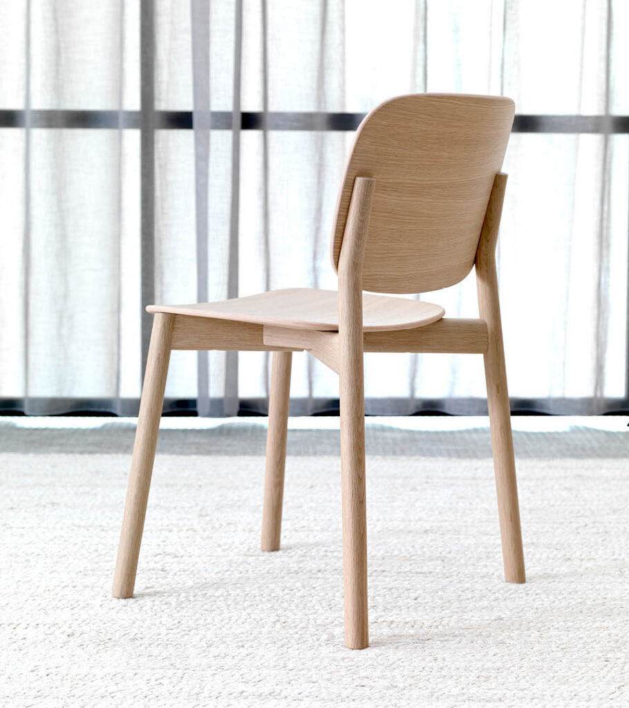
Kitt Prototype #4
How did you achieve the balance and subtlety of the form?
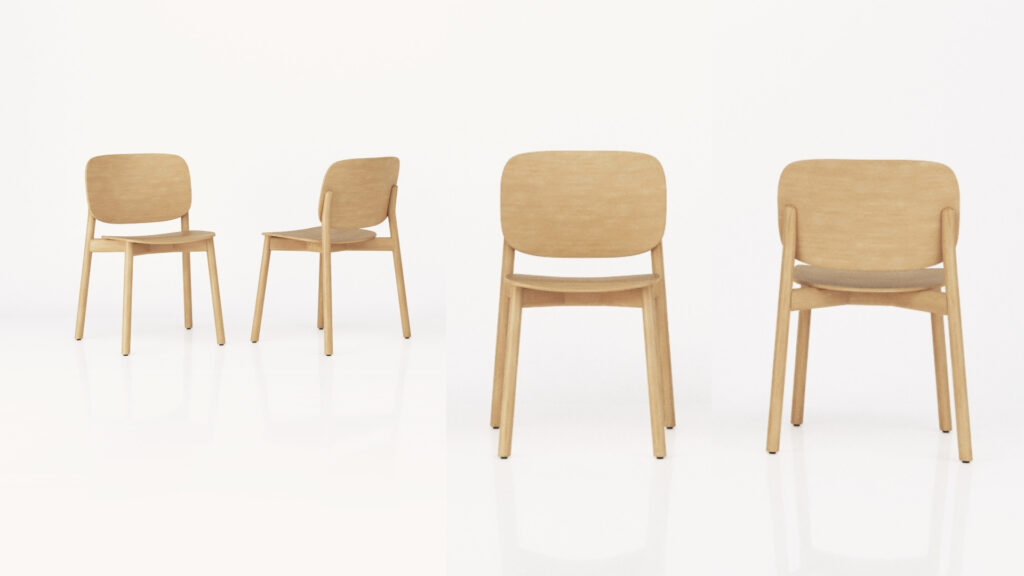
I think this comes back to the idea that it’s been engineered to use minimal form, slender profiles and very much a reduced frame design to take everything back to the basics of what the chair needed to perform correctly, both on a structural level and a comfort level. It is very much a process of reduction – to reduce, filter and minimise the number of elements needed to make this chair work.
What was most important to you when you developed Kitt?
When designing something, it’s critical to understand that what people sit on, lie on or stand at affects how they feel and therefore how they perform at what they’re doing – whether it’s talking, interacting, being alone, socialising, eating or whatever it is. How they feel has an impact, and you have to understand how you want people to feel and appreciate your ability to influence that behaviour and direct that emotion.
Aesthetically, where we wanted to get to, and it goes back to creating the right emotional expectation from a product like this, was to make it appear welcoming, and I think that the inviting nature comes from a deliberate oversizing and over-widening of the back in relation to the seat. It does create an attractive appearance to the chair which says, ‘This looks comfortable, this feels inviting.’
How is Kitt better than others in its category?
There are lots of this type of chair – two wooden laminations on a simple wooden frame – and it’s really difficult to reinvent the wheel, but I think Kitt is going to be one of the best of its type. Every effort has gone into adjusting and fine tuning every aspect possible to achieve this.
